Project
Homeland Security
Home Page Redesign
Role
Product Designer
Timeline
Sep-Nov 2022

The Problem
The Problem
Homeland Security's information overload is causing users to struggle in locating essential information, eroding confidence and leading to a decline in user conversion. Causing, frustrated users to opt for alternative websites to find the information they need.
Homeland Security's information overload is causing users to struggle in locating essential information, eroding confidence and leading to a decline in user conversion. Causing, frustrated users to opt for alternative websites to find the information they need.
“I have no idea where the heck I am supposed to look, this is the problem with government sites, too much BS”
“I have no idea where the heck I am supposed to look, this is the problem with government sites, too much BS”
- Quote from Usability Tester
- Quote from Usability Tester
The Solution
The Solution
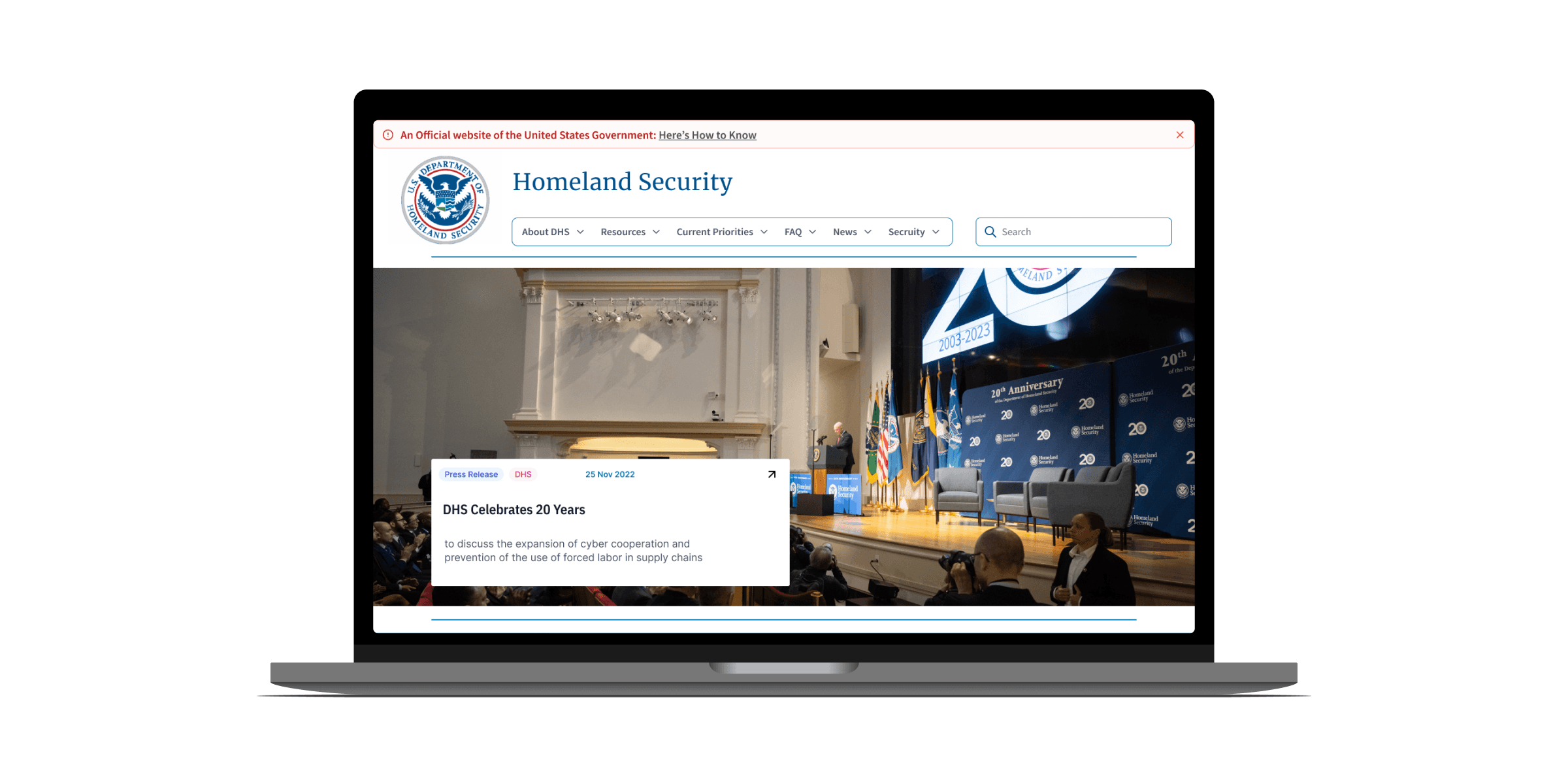
Enhance the Homeland Main Navigation and Homepage by streamlining content, optimizing the information architecture, and ensuring a seamless user experience.
Enhance the Homeland Main Navigation and Homepage by streamlining content, optimizing the information architecture, and ensuring a seamless user experience.
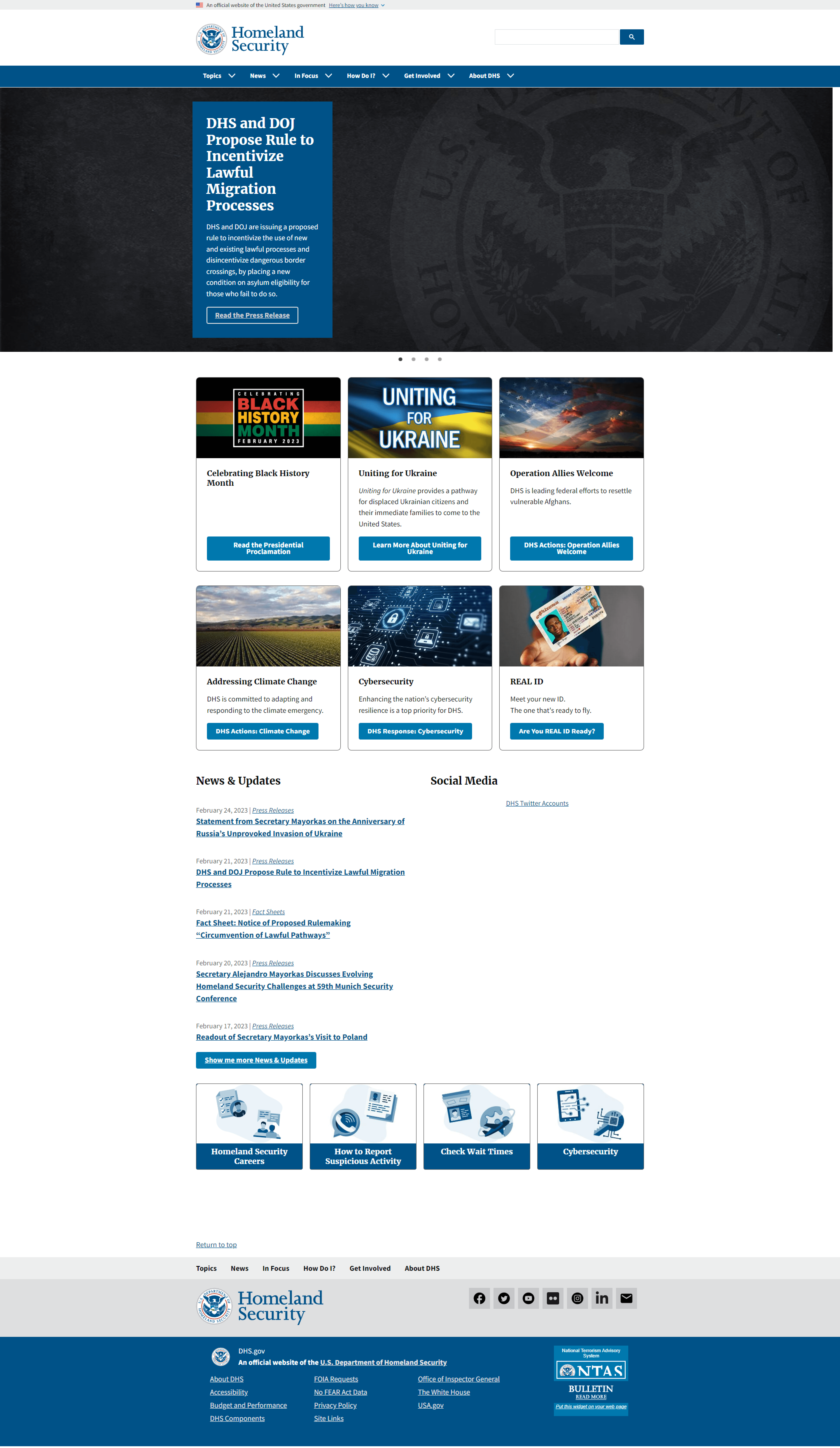
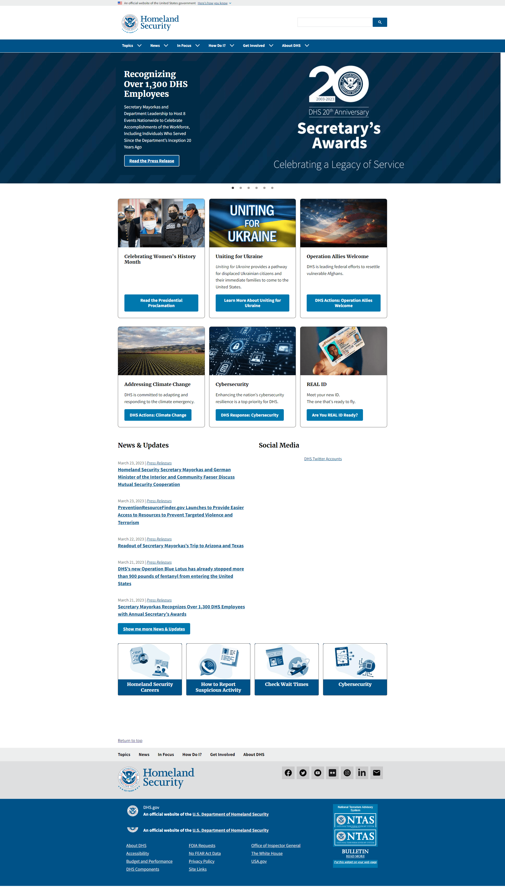
Before vs After
Before vs After


Identifying the Problem
Identifying the Problem
Users struggled to find specific information in the main header navigation, leading 100% of users to resort to the search bar. However, the search bar added to the confusion initiated by the navigation bar.
Users struggled to find specific information in the main header navigation, leading 100% of users to resort to the search bar. However, the search bar added to the confusion initiated by the navigation bar.
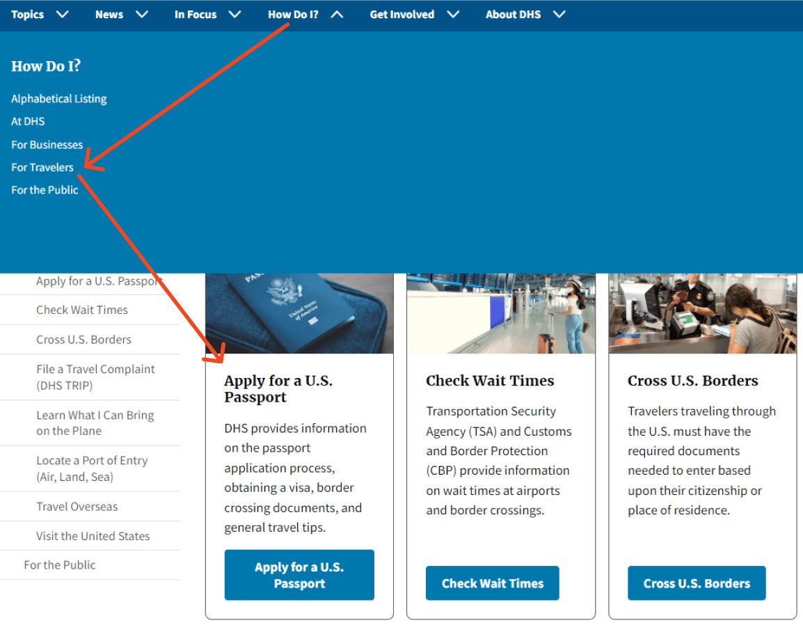


"How Do I" Navigation
"How Do I" Navigation
The "How Do I" section (located in the main navigation) caused increased confusion as users were asked a question without options to choose from, leading them to click on incorrect tabs where information was unexpectedly located.
5
Objective focused interviews
Objective Interviews
4
Usability Tests on Current Site
2
Rounds of Testing
Menu and Homepage Rework
Government Style Requirements
Government Style Requirements
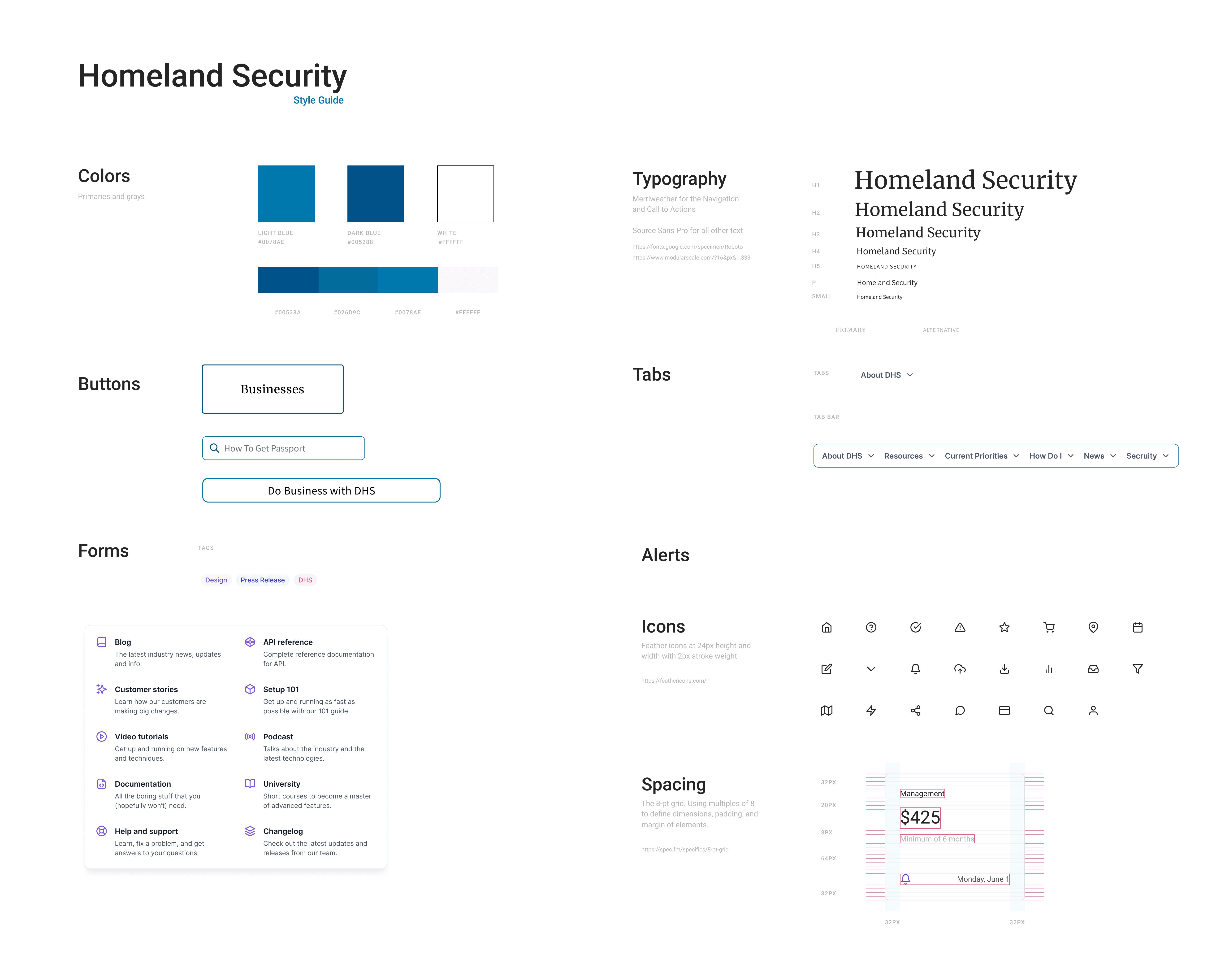
I maintained consistency with Homeland's current brand by adhering to their set style guide for achieving the desired look and feel.


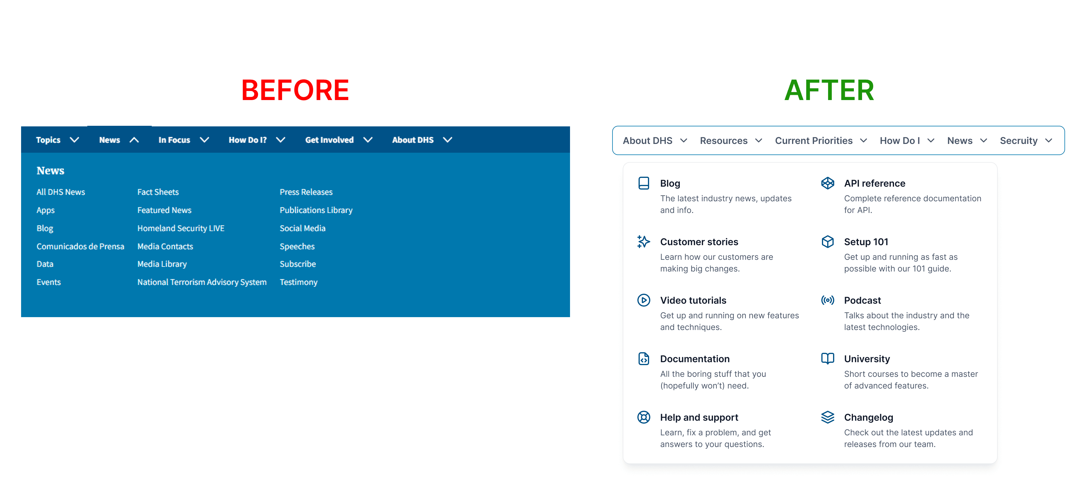
Homepage Navigation Update
Homepage Navigation Update
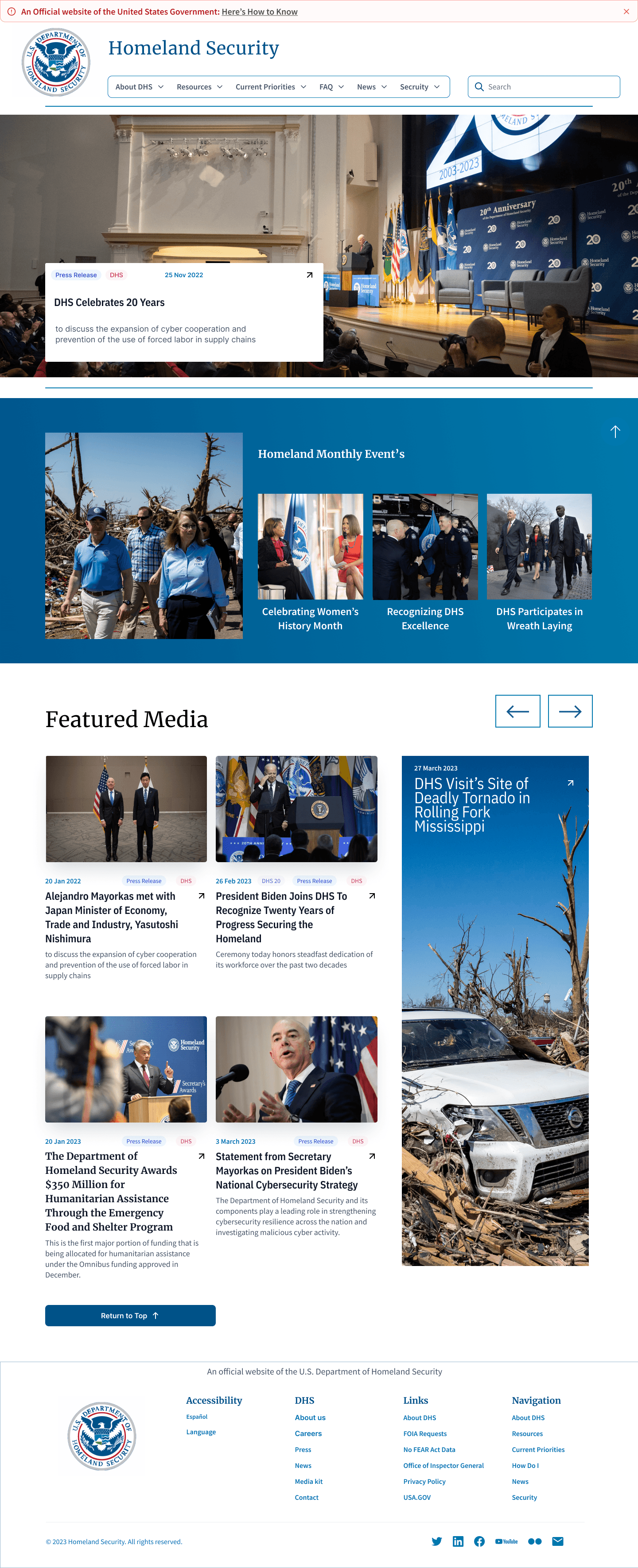
Reorganizing the information within the navigation enhanced visibility and provided more descriptive cues for users. Another advantage was the improved visibility of the rest of the page.
Reorganizing the information within the navigation enhanced visibility and provided more descriptive cues for users. Another advantage was the improved visibility of the rest of the page.


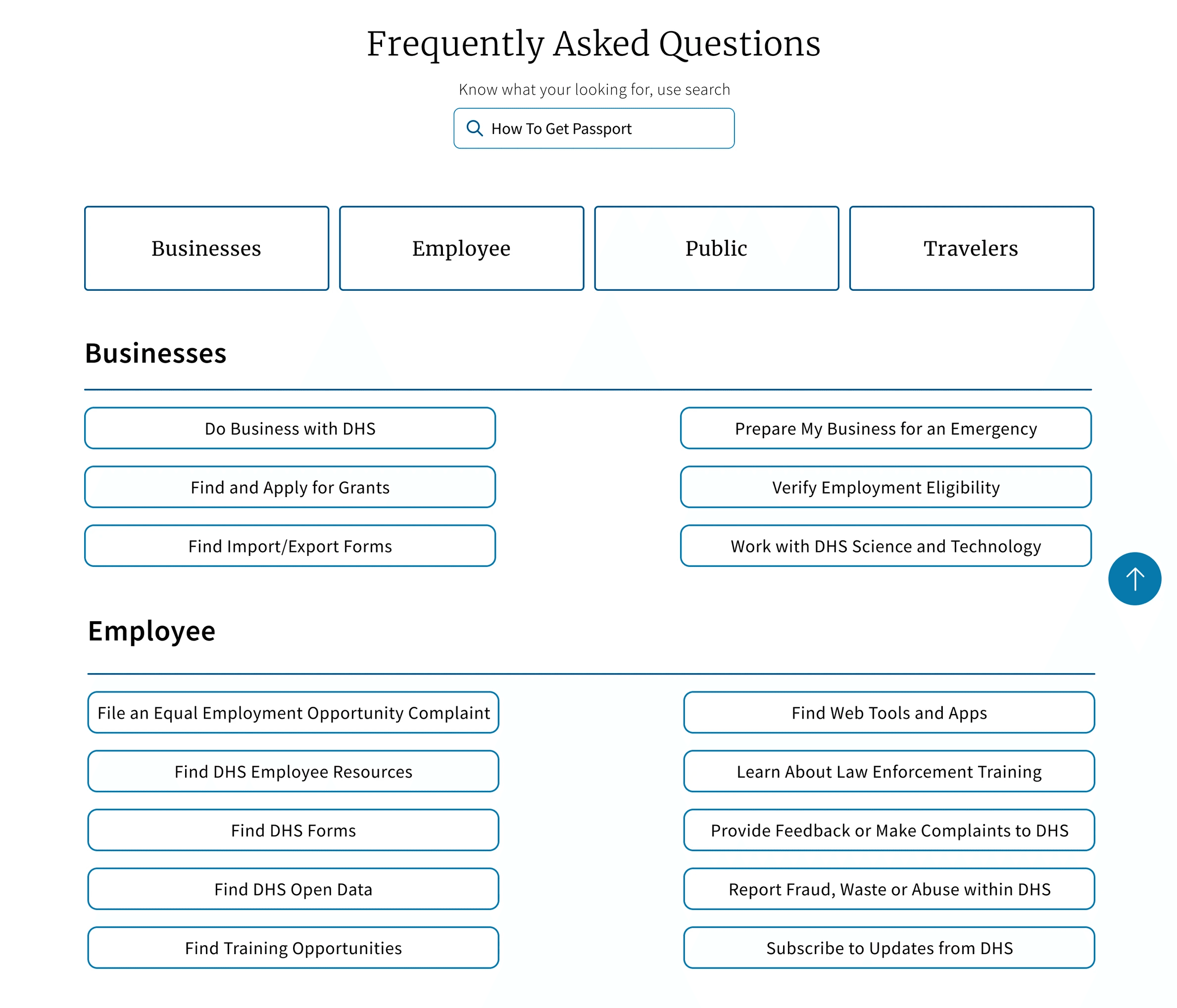
"How Do I" Section Rework
"How Do I" Section Rework
"How Do I" Section Rework
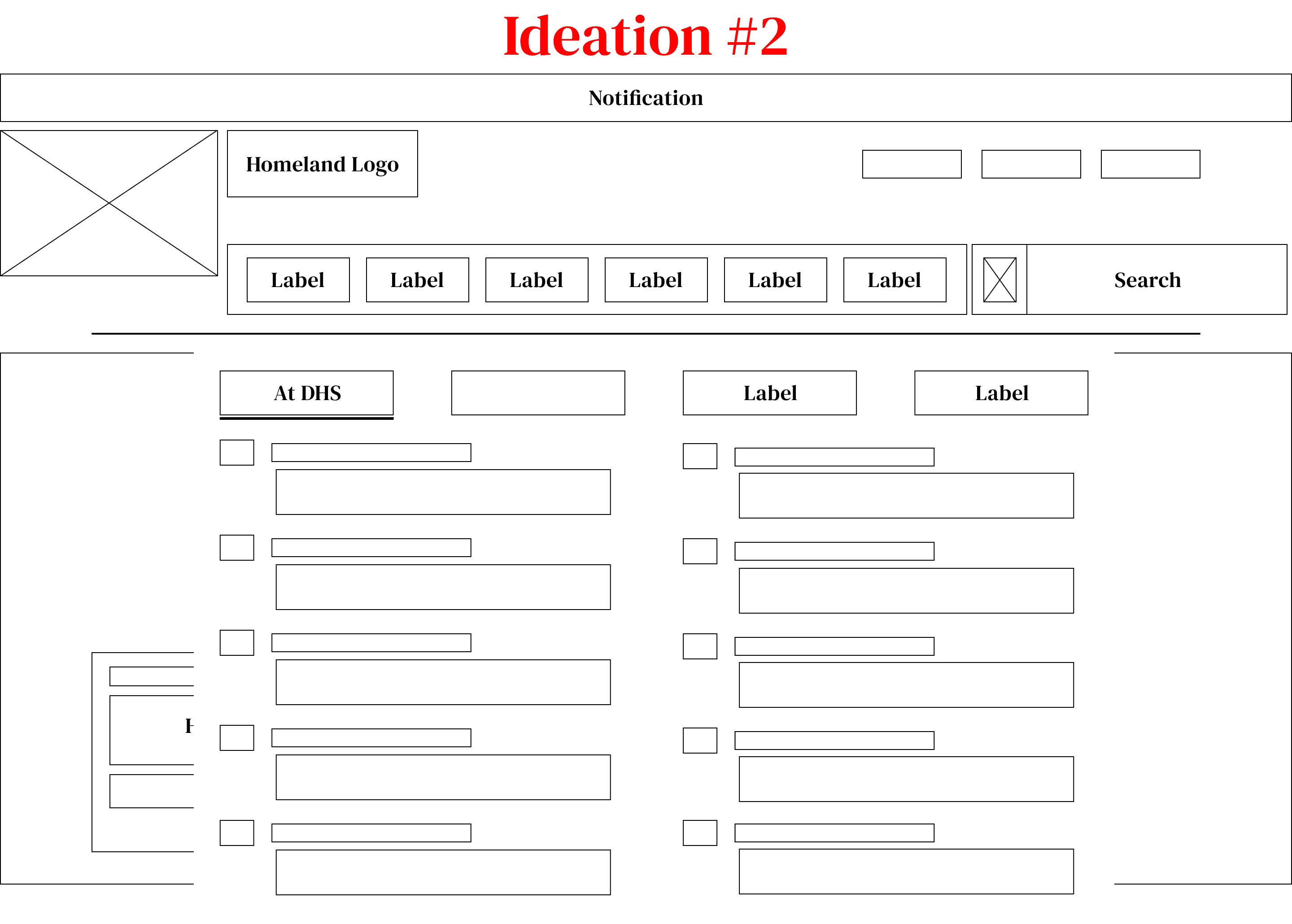
"How Do I" section was changed into a direct link to separate page and renamed to FAQ to alleviate user confusion.
"How Do I" section was changed into a direct link to separate page and renamed to FAQ to alleviate user confusion.
The new FAQ page allowed for all of the information residing in the How Do I section to be in one place. Removing the need to play a words game with users to find information.
The new FAQ page allowed for all of the information residing in the How Do I section to be in one place. Removing the need to play a words game with users to find information.
Homepage Layout
Homepage Layout
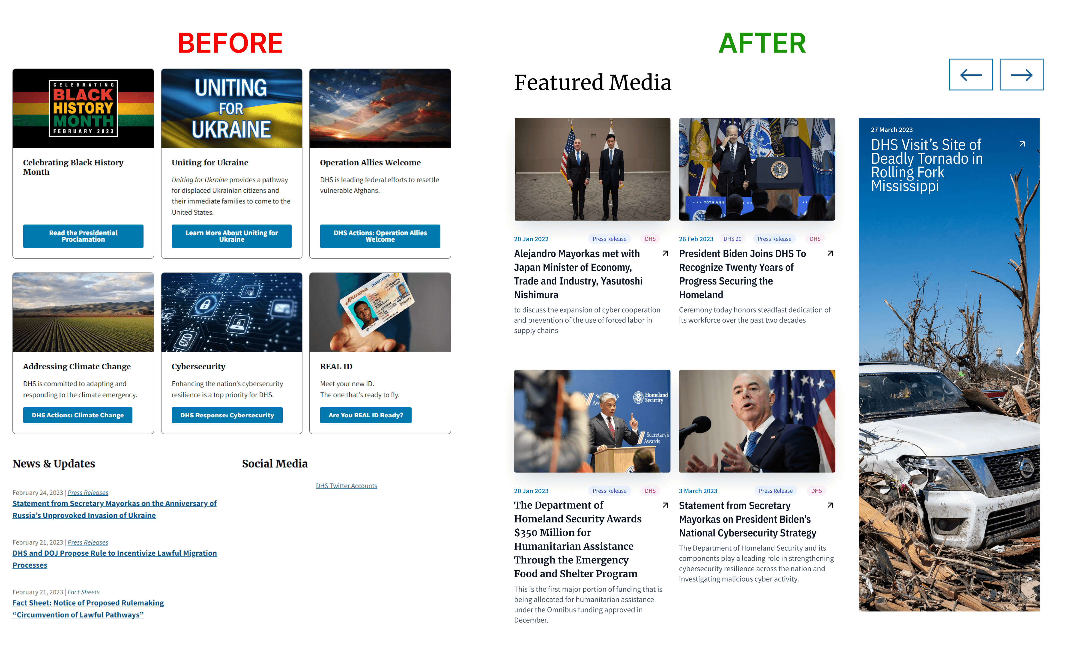
The homepage underwent a redesign to optimize available space by reformatting the use of cards for displaying information and expanding the news section to include more than just links to news and
The homepage underwent a redesign to optimize available space by reformatting the use of cards for displaying information and expanding the news section to include more than just links to news and


Testing
6
Interviews
5
Usability Tests
2
Rounds of Testing
Testing Rounds
FAQ Section Testing
FAQ Section Testing
The FAQ Section received significant feedback from users, with the main issue, trying to fit to much within the confines of the new navigation. This lead to the removal of the tab all together and was created as a direct link to a separate page
The FAQ Section received significant feedback from users, with the main issue, trying to fit to much within the confines of the new navigation. This lead to the removal of the tab all together and was created as a direct link to a separate page


FAQ Section Testing
FAQ Section Testing
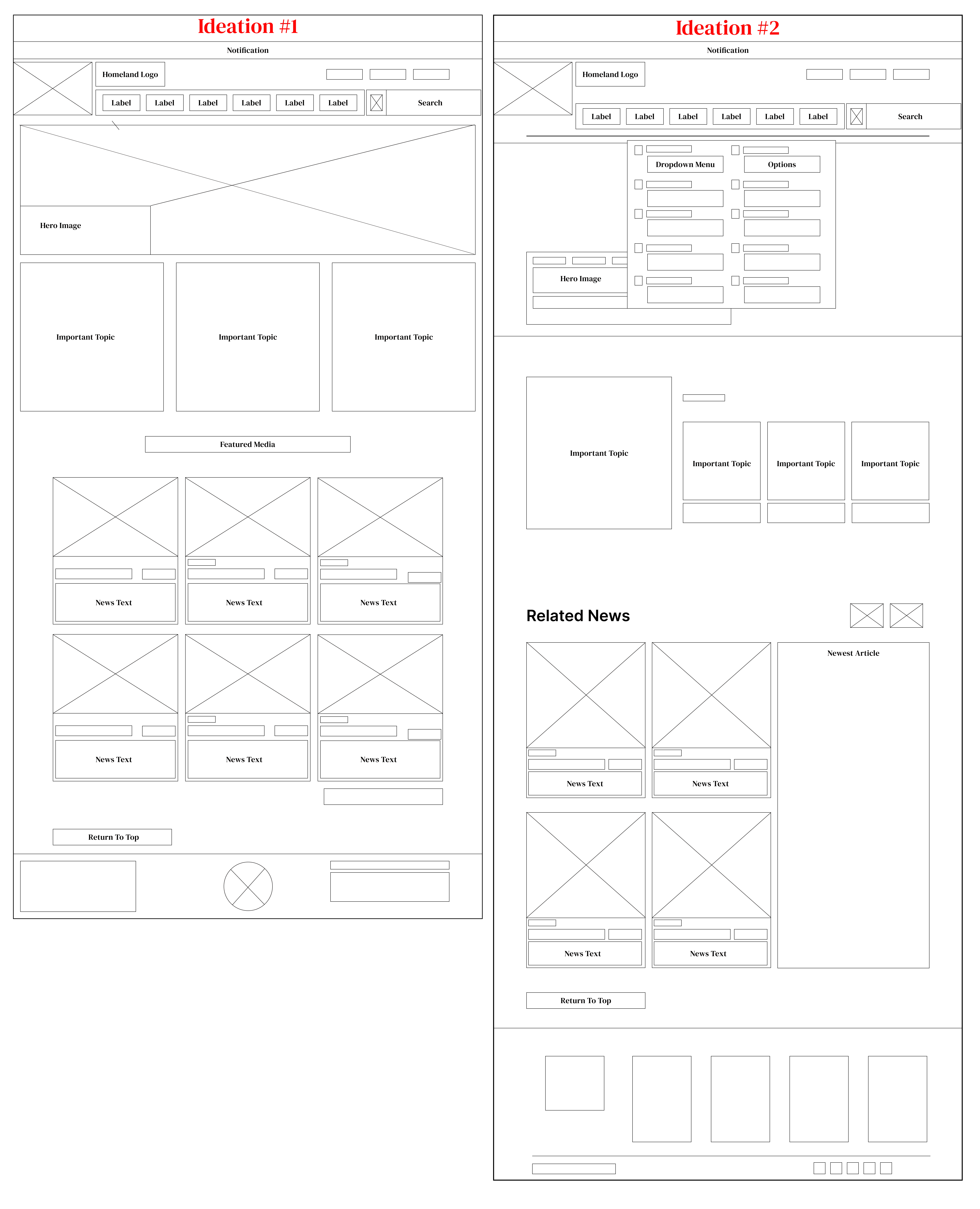
During the first iteration, the homepage led to user confusion due to the uniform presentation of information. To tackle this, the second iteration focused on implementing effective information chunking by categorizing the content into two distinct sections: Events and Featured Media
During the first iteration, the homepage led to user confusion due to the uniform presentation of information. To tackle this, the second iteration focused on implementing effective information chunking by categorizing the content into two distinct sections: Events and Featured Media
Connect to Content
Add layers or components to make infinite auto-playing slideshows.
During the first iteration, the homepage led to user confusion due to the uniform presentation of information. To tackle this, the second iteration focused on implementing effective information chunking by categorizing the content into two distinct sections: Events and Featured Media
During the first iteration, the homepage led to user confusion due to the uniform presentation of information. To tackle this, the second iteration focused on implementing effective information chunking by categorizing the content into two distinct sections: Events and Featured Media
Where I Landed
The final design stands to reduce user confusion for the navigation by better consolidating and providing context on the information presented. While also giving better use to white space and information architecture on the homepage
The final design stands to reduce user confusion for the navigation by better consolidating and providing context on the information presented. While also giving better use to white space and information architecture on the homepage
Next Steps/Conclusion
Next Steps/Conclusion
During the first iteration, the homepage led to user confusion due to the uniform presentation of information. To tackle this, the second iteration focused on implementing effective information chunking by categorizing the content into two distinct sections: Events and Featured Media
During the first iteration, the homepage led to user confusion due to the uniform presentation of information. To tackle this, the second iteration focused on implementing effective information chunking by categorizing the content into two distinct sections: Events and Featured Media
Before vs After


CNDezign
