Project
Menuz
Role
Product Designer
Timeline
January-March 2023


The Problem
The Problem
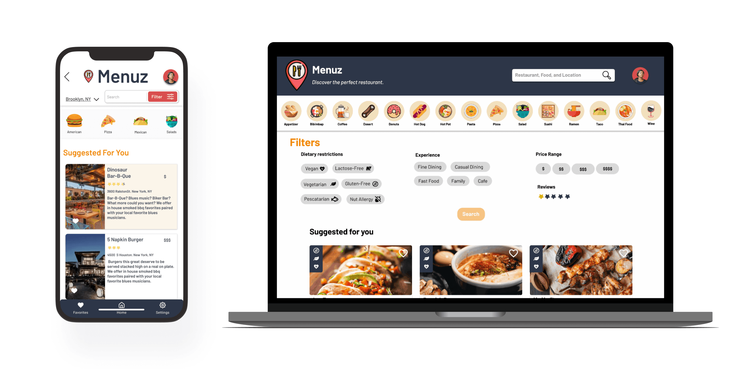
Current online menus often lack accuracy and are difficult to navigate. Our goal is to enhance the online menu browsing experience, enabling users to search for dining options tailored to their preferences with confidence and efficiency. How can we achieve this?
Current online menus often lack accuracy and are difficult to navigate. Our goal is to enhance the online menu browsing experience, enabling users to search for dining options tailored to their preferences with confidence and efficiency. How can we achieve this?
The Solution
The Solution
Creating a user-friendly online menu that providing users with comprehensive information, including pictures, ingredient lists, allergy restrictions, and filters for food type and cuisine.
Creating a user-friendly online menu that providing users with comprehensive information, including pictures, ingredient lists, allergy restrictions, and filters for food type and cuisine.
Getting Ahead of Ourselves
Getting Ahead of Ourselves
Initially, we overlooked the importance of defining the problem, leading to numerous ideas and a lack of understanding of our users. To address this, we prioritized research, focusing on our target audience and identifying pain points for current online menu's
Initially, we overlooked the importance of defining the problem, leading to numerous ideas and a lack of understanding of our users. To address this, we prioritized research, focusing on our target audience and identifying pain points for current online menu's
Identifying the Problem
Identifying the Problem
31
Google Form Responses
6
Usability Tests
2
Iterations of Testing
31
Google Form Responses
6
Usability Tests
2
Iterations of Testing
Research shows that 90% of users check the menu ahead of time and make their dining decisions. However, over 60% of users may opt not to visit a restaurant if the online menu proves difficult to use.
Research shows that 90% of users check the menu ahead of time and make their dining decisions. However, over 60% of users may opt not to visit a restaurant if the online menu proves difficult to use.
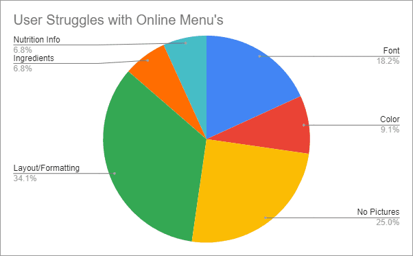

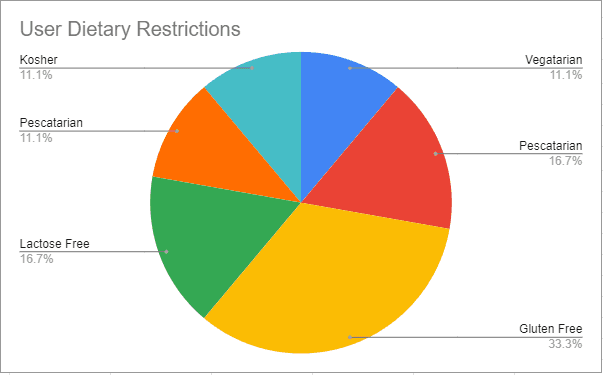

Users cited their main issues with online menus, included the absence of detailed information regarding allergies, ingredients, and pictures showcasing the appearance of the dishes.
Users cited their main issues with online menus, included the absence of detailed information regarding allergies, ingredients, and pictures showcasing the appearance of the dishes.
“6.5% of American adults and 5.8% of children with food allergies”
“6.5% of American adults and 5.8% of children with food allergies”
- FDA Food Allergies Research
- FDA Food Allergies Research
Competitor Analysis
Competitor Analysis
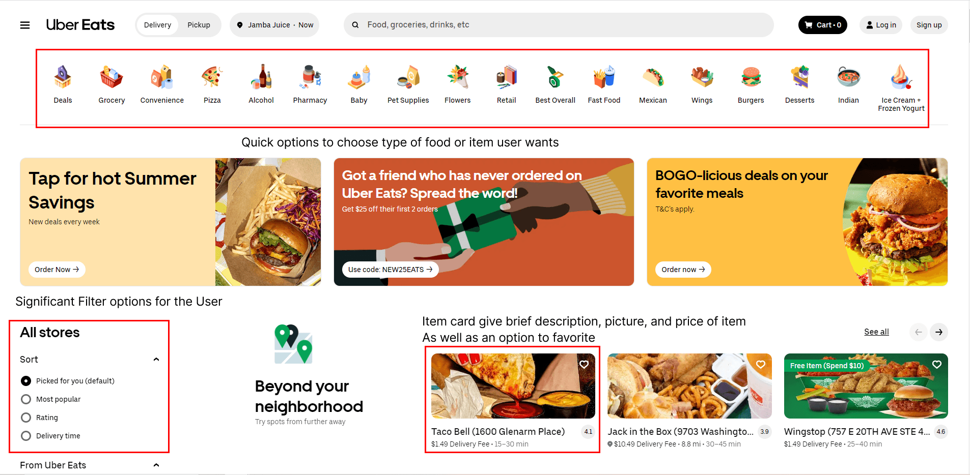
To gain insight into user preferences, we conducted a Competitor Analysis on intermediary services like Doordash, Chownow, and Uber Eats. Although these platforms lacked many desired features based on user feedback, they prioritized a standard and clean interface for presenting information to the user.
To gain insight into user preferences, we conducted a Competitor Analysis on intermediary services like Doordash, Chownow, and Uber Eats. Although these platforms lacked many desired features based on user feedback, they prioritized a standard and clean interface for presenting information to the user.


Creating A Solution
Creating A Solution
Low Fidelity Prototype
Low Fidelity Prototype
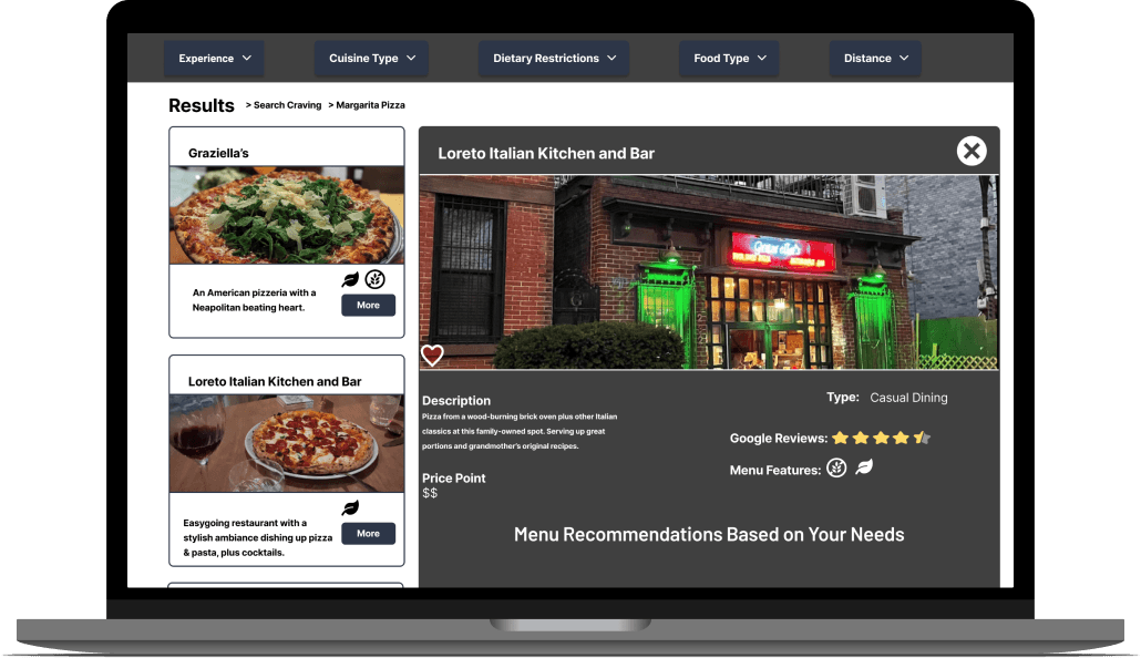
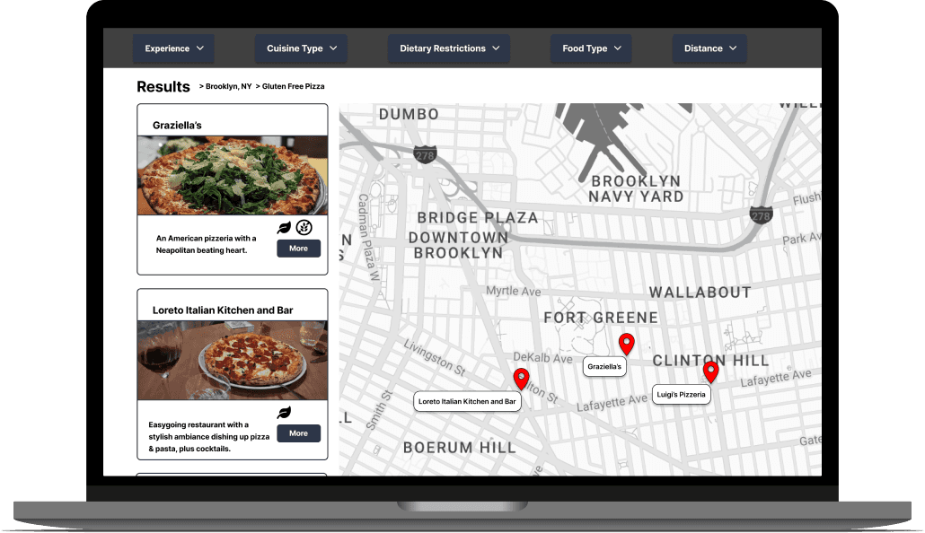
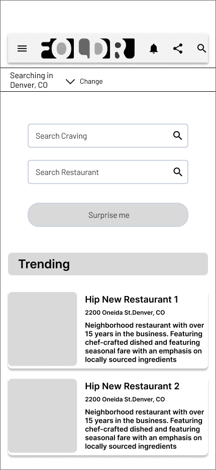
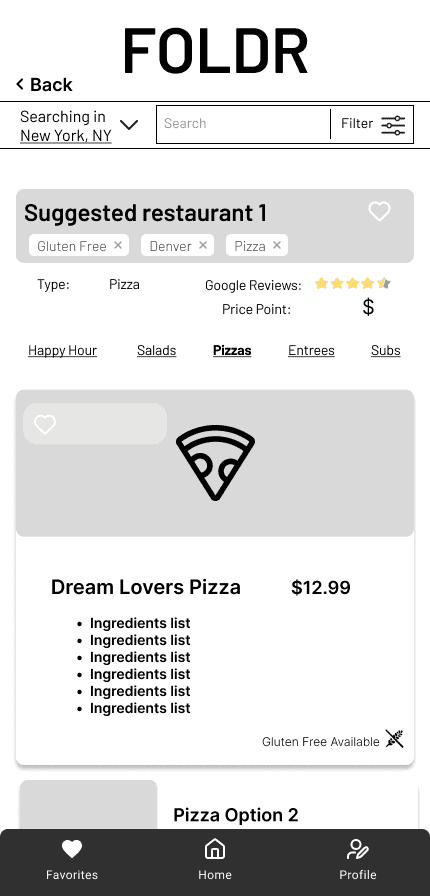
The primary focus was on crafting a clean and simple menu interface, enabling easy identification of food types and restaurants. Aiming to enhance user experience by providing better filters for more personalized food searches.
The primary focus was on crafting a clean and simple menu interface, enabling easy identification of food types and restaurants. Aiming to enhance user experience by providing better filters for more personalized food searches.
Desktop
Desktop



Mobile

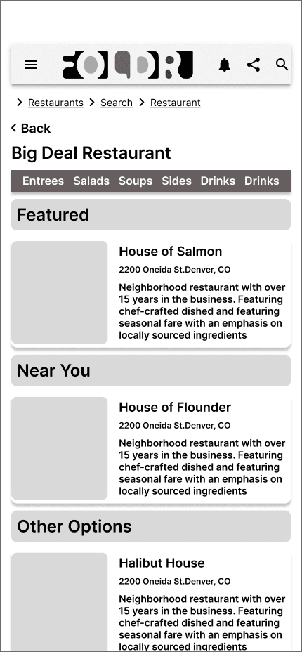


Mobile
Testing
8
Iterations
12
Usability Tests
2
Rounds of Testing
8
Interviews
12
Usability Tests
2
Rounds of Testing
User Testing Round 1
User Testing Round 1
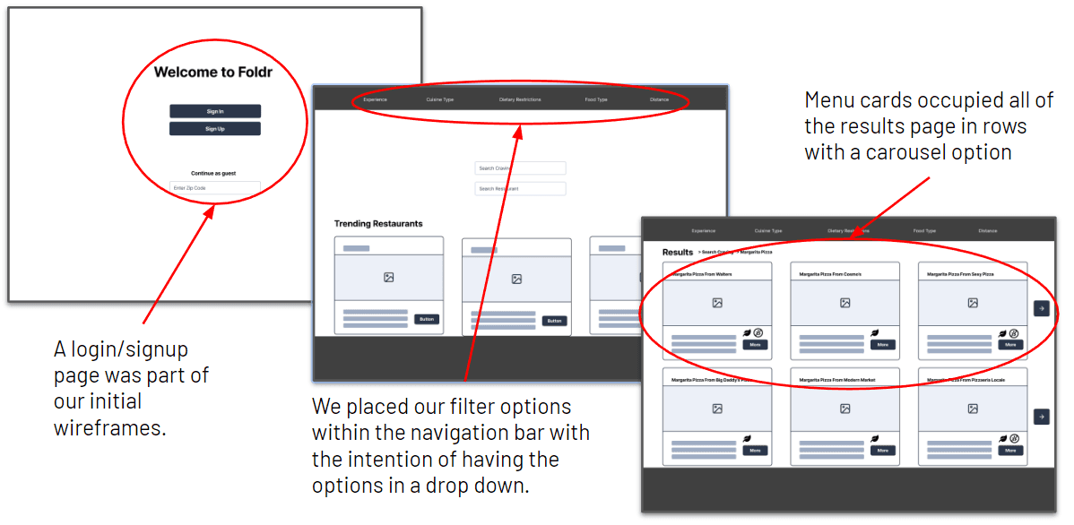
We identified significant flaws in both the mobile and desktop versions, impeding the desired ease of use when searching for a restaurant's menu. Major changes were implemented, including improvements to filters, touch targets, the drop-down main menu, and the removal of the initial sign-in feature.
We identified significant flaws in both the mobile and desktop versions, impeding the desired ease of use when searching for a restaurant's menu. Major changes were implemented, including improvements to filters, touch targets, the drop-down main menu, and the removal of the initial sign-in feature.


User Testing Round 2
User Testing Round 2
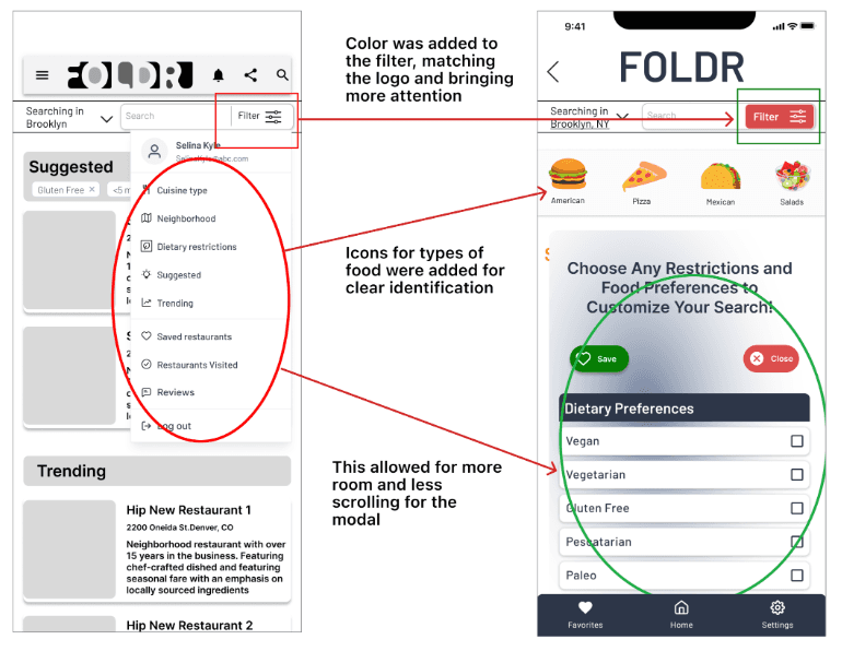
In the 2nd testing phase, we focused on enhancing menu accessibility and usability based on valuable feedback. This included making the mobile filter icon less obtrusive, prioritizing a larger desktop menu card, and addressing confusion with search bar interaction after selecting filters.
In the 2nd testing phase, we focused on enhancing menu accessibility and usability based on valuable feedback. This included making the mobile filter icon less obtrusive, prioritizing a larger desktop menu card, and addressing confusion with search bar interaction after selecting filters.

Slight Design Change
Slight Design
Change
Re-work of Desktop Homepage
Re-work of Desktop Homepage
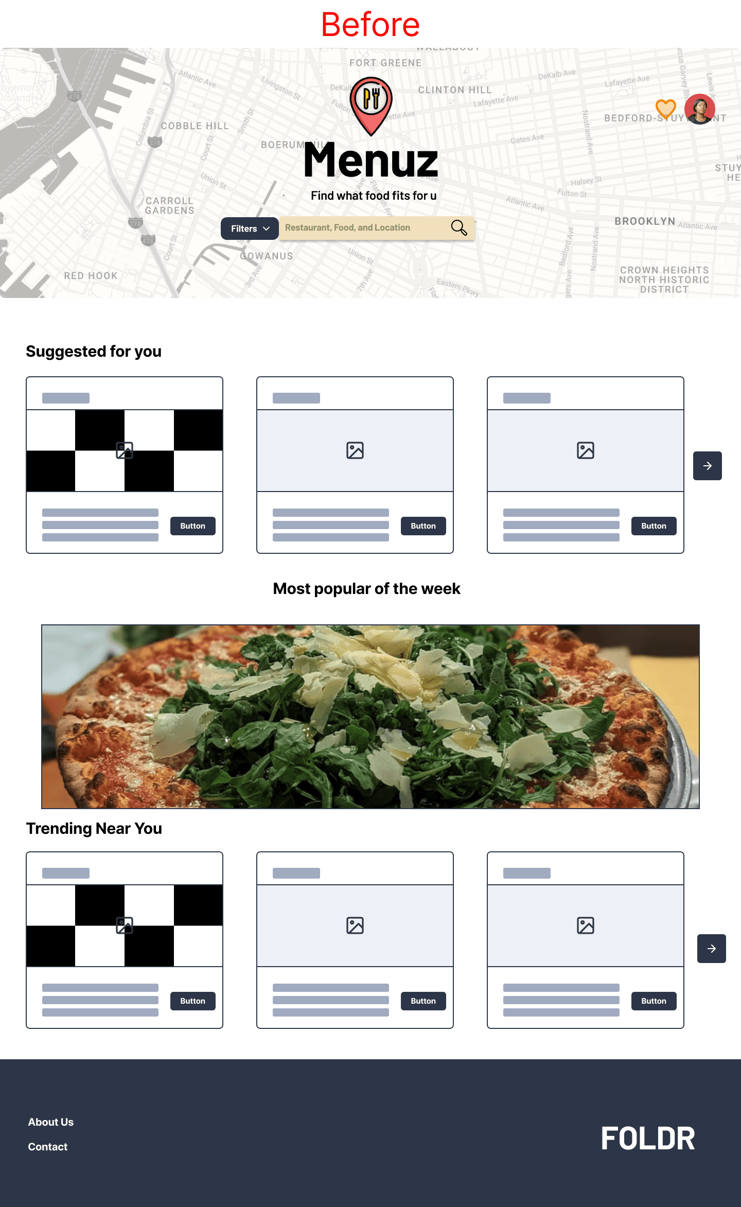
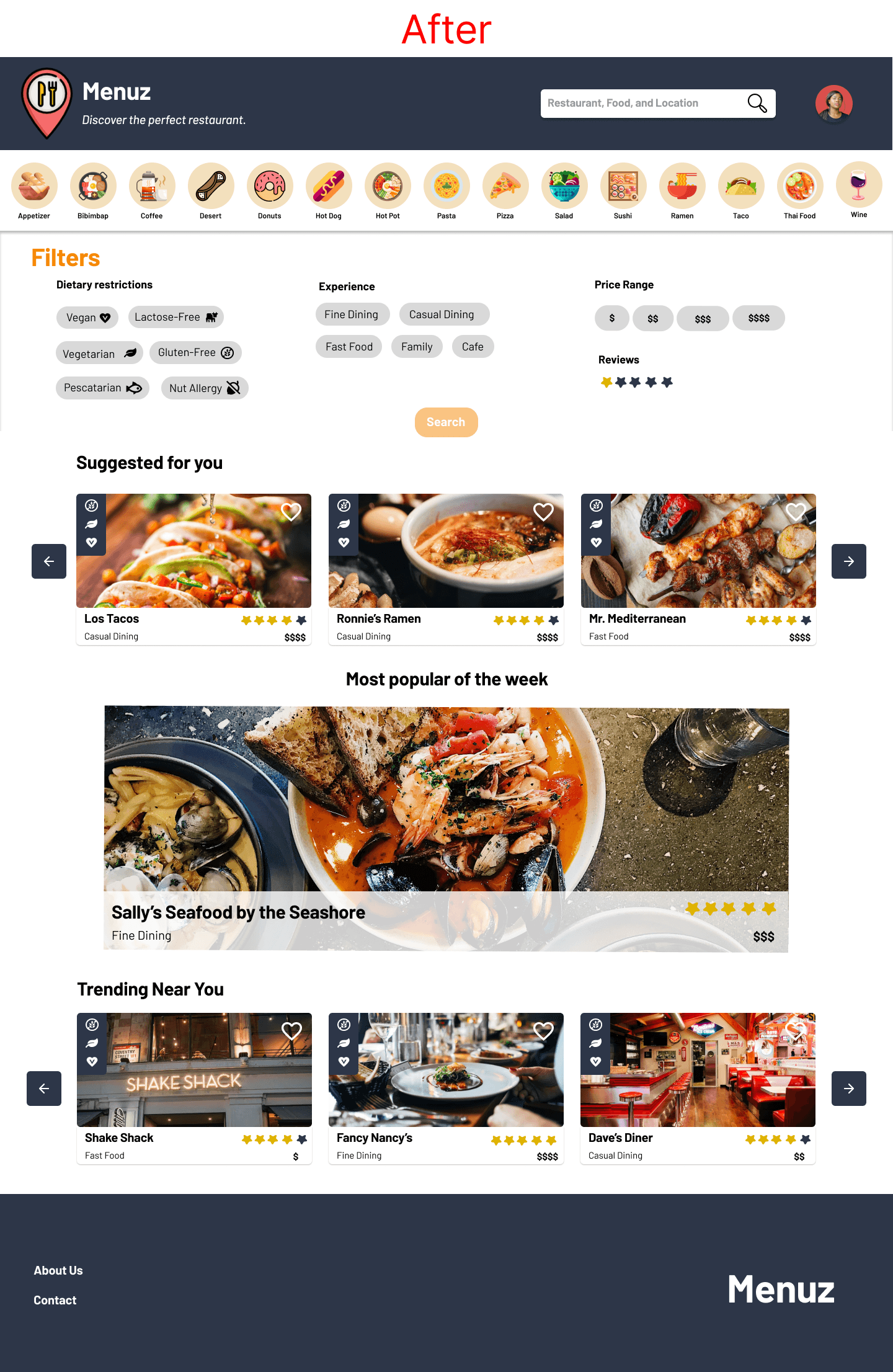
We revised the desktop's top navigation and hero section. We eliminated drop-down menus for filters, ensuring they remained visible on the page, and added a food selection button at the top, providing users with more variety without additional searching.
We revised the desktop's top navigation and hero section. We eliminated drop-down menus for filters, ensuring they remained visible on the page, and added a food selection button at the top, providing users with more variety without additional searching.


Re-work of Mobile Homepage
Re-work of Mobile Homepage
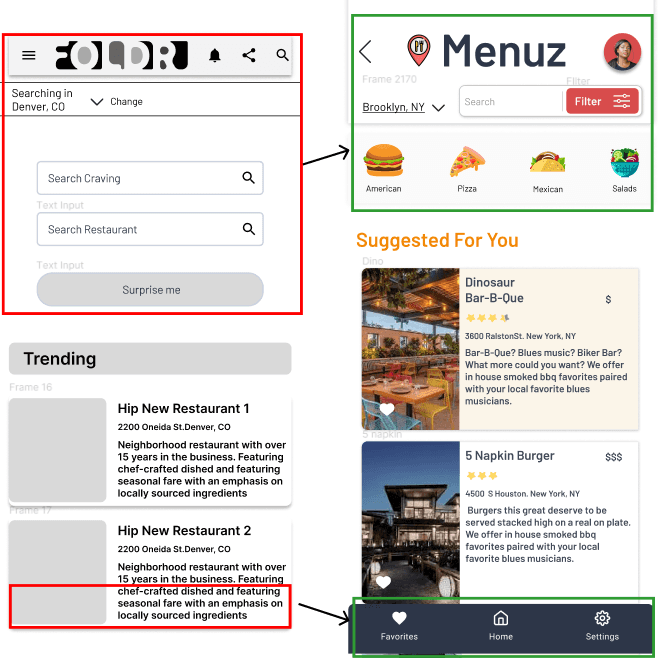
After the testing concluded, the primary focus was on enhancing UI elements for the Bottom Nav and decluttering the top of the screen to improve visibility for actionable inputs/buttons. This aimed to prevent users from feeling overwhelmed by the information presented on the screen.
After the testing concluded, the primary focus was on enhancing UI elements for the Bottom Nav and decluttering the top of the screen to improve visibility for actionable inputs/buttons. This aimed to prevent users from feeling overwhelmed by the information presented on the screen.


Where I Landed
Final Touchups
Final Touchups
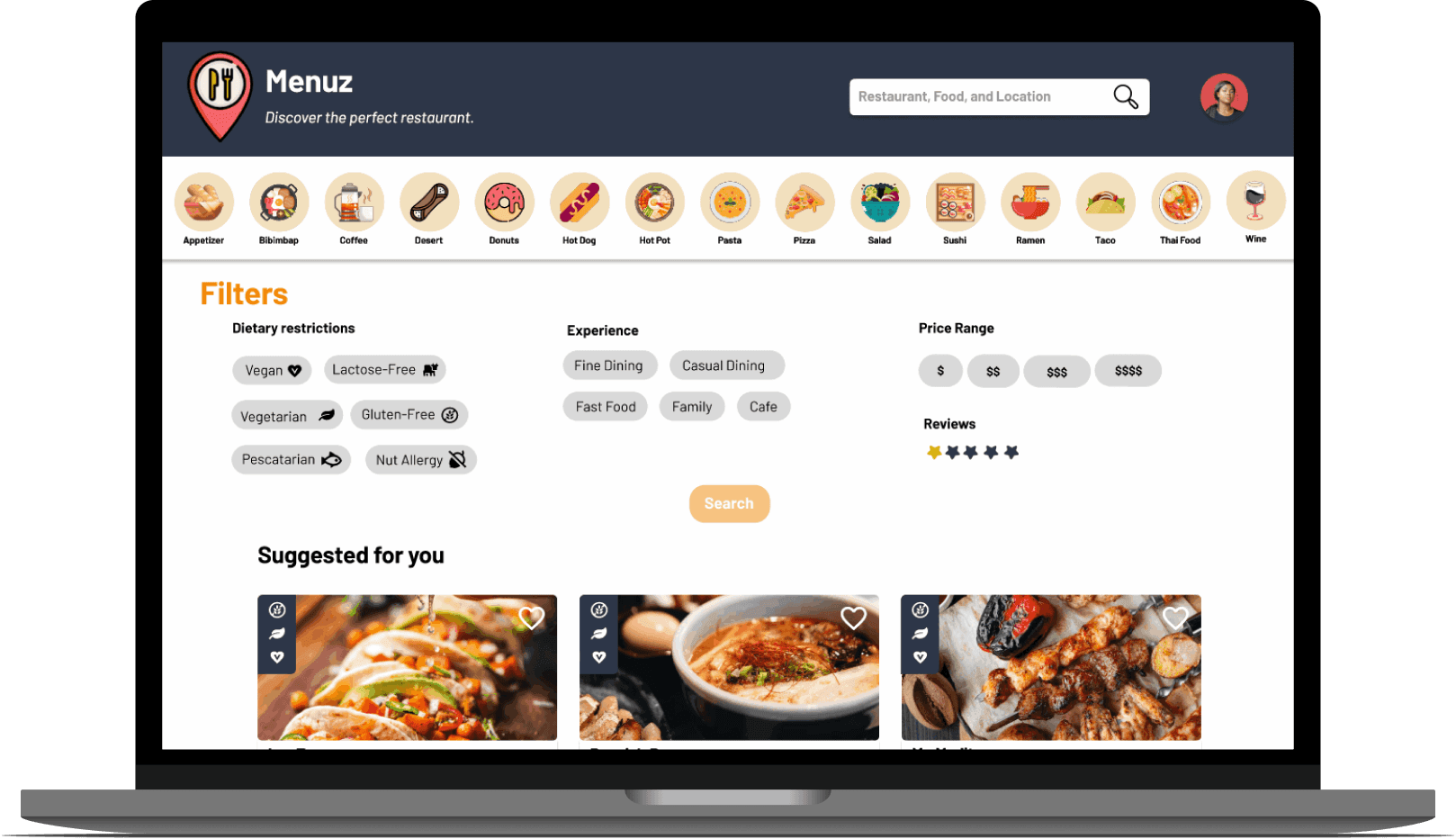
Following the implementation of user feedback-driven changes, we conducted one final testing round. While a few minor adjustments were identified, the overall testing process went smoothly.
Following the implementation of user feedback-driven changes, we conducted one final testing round. While a few minor adjustments were identified, the overall testing process went smoothly.
Final Designs

Final Designs


Have a Cool Idea?
Let's Connect!
Project
Project
Project
Homeland Security
Home Page Redesign
Menuz
Menuz
Role
Role
Role
Product Designer
Timeline
Timeline
Timeline
Sep-Nov 2022
CNDezign
